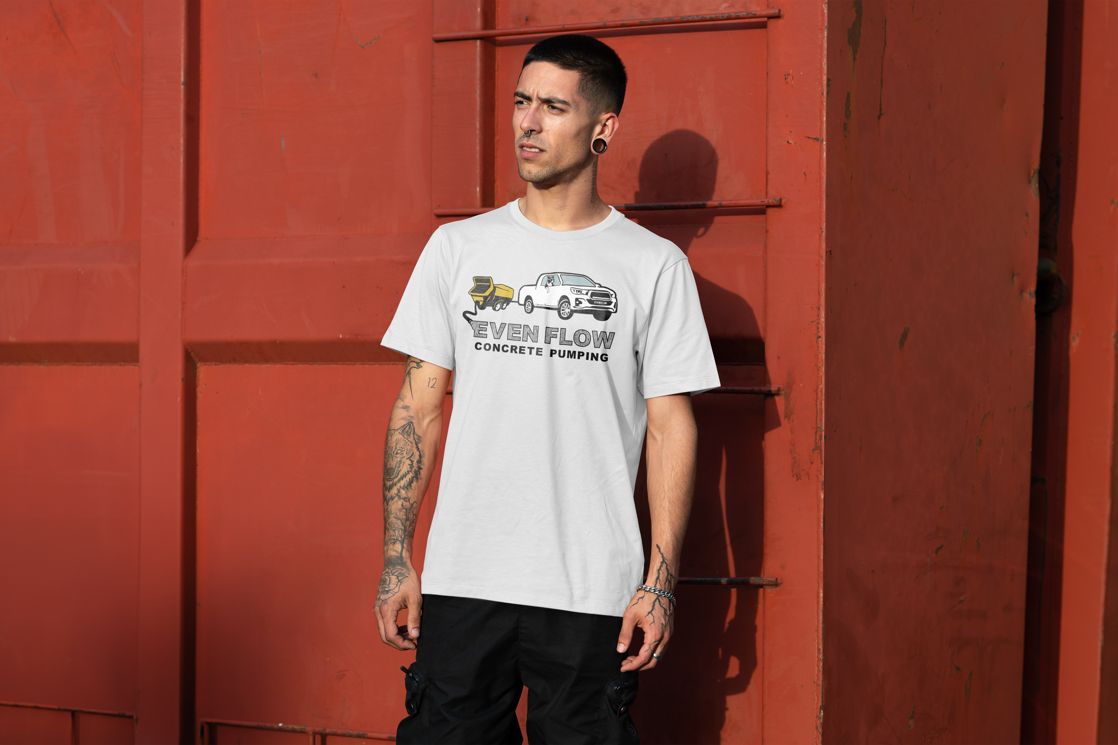
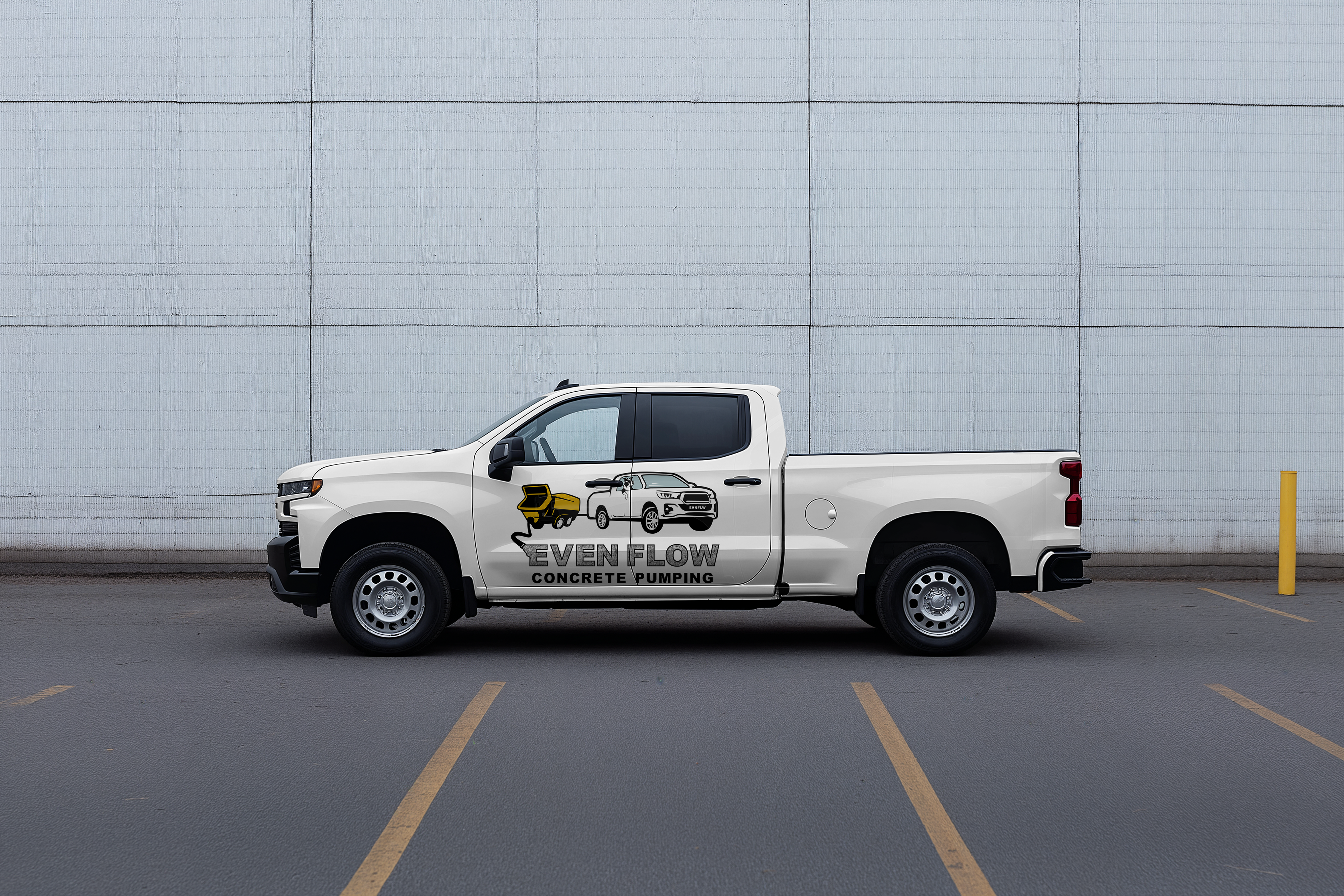
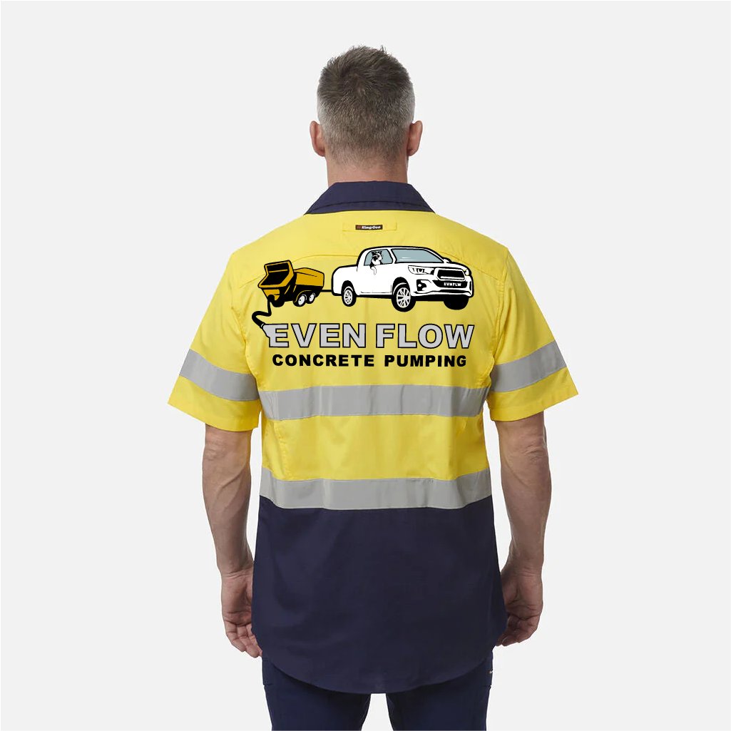
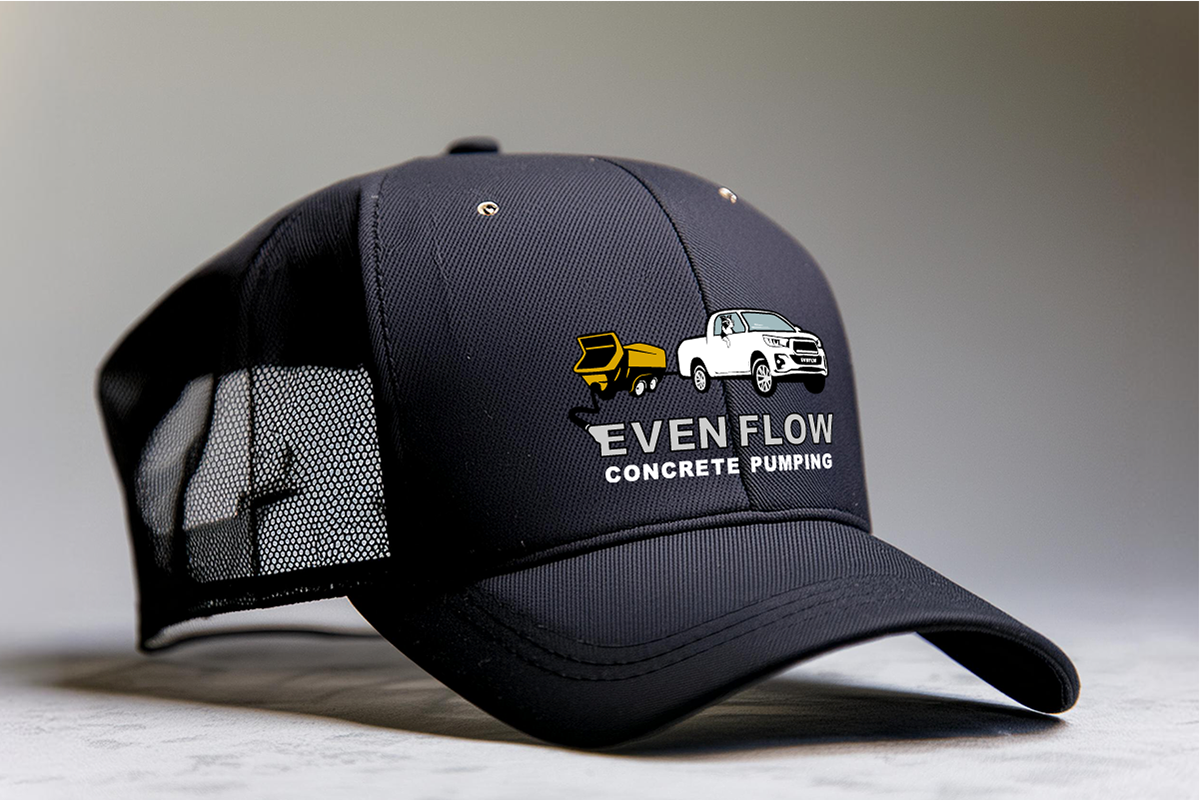
The Brief A memorable and locally relevant brand identity balancing professional reliability with a friendly, affordable service message. The design challenge was integrating three personal, non-negotiable elements, a white ute, a yellow concrete pump trailer, and a Border Collie, without sacrificing credibility on the job site. The Result The final logo is a highly effective, illustrative mark that immediately connects with the intended audience. The design strategically features a detailed, graphic illustration of the white ute and yellow pump trailer, clearly communicating the core service and operational reliability. This direct visual approach appeals strongly to time-sensitive tradesmen. The Border Collie element instantly conveys the brand's commitment to friendly, trustworthy service and an affordable, fair rate, distinguishing them from impersonal competitors. The typography uses a bold, industrial-style font for "EVEN FLOW," grounding the mark in professionalism. The combined effect is a distinctive, recognisable logo that serves as a powerful promise of both quality execution and approachable, local service.